

After your headline, the call to action is the most important part of your piece. But it’s so easy to get wrong because we reduce the CTA to simple, related resources. Sometimes it’s a lead magnet. Sometimes it’s a newsletter signup. Sometimes it’s a demo request.
Most of the time it’s reductionist. And it misunderstands the underlying psychology of getting people to engage.
A review of biological and physiological studies on motivation published in the Behavioral Neuroscience of Motivation highlights that motivation might be the effect, not the cause. In other words, action comes first.
Re-centering Action
It seems intuitive that action follows motivation. But that’s incorrect. Action leads to more motivation. In theory, this can build momentum. Your goal in writing CTAs is to build that momentum to promote further action.
Let’s consider the realistic “action-first” workflow. Let’s say an accounting lead is short-staffed and needs a faster way to complete invoicing by the end of the month. That stimulus demands action: So she googles “best invoicing automation software.” She opens the top five articles—yours is number three.
She’s already acted–twice, technically. She’s identified her problem and began pursuing a solution. Now you need to sustain that motivation and provide a stimulus for another action. The motivation is in the middle. To craft a master CTA and capture that lead, you need to amp up motivation to link the actions.
Unfortunately, it’s all too common to embed a CTA in a conclusion paragraph. This is easily skimmed. A call to action is often pushed to the end in the name of “value.” But value cannot be templated. Instead, it must connect the reader’s experience and evaluation process.
4 Questions to Drive Conversions
Assuming you have quality traffic that mirrors your industry benchmarks, you are close to boosting conversions. Your ideal customers are on your page, but how can you promote action? You need to figure out:
- What prompted them to click on your page (what problem are they trying to solve)
- What asset would quickly solve or support that immediate journey?
- What motivation do they have to continue the journey?
- How easy is it for them to take action (too hard or too easy and they can lose motivation)?
These four questions offer a quick guide to determine the relevance and momentum of your CTA. With these, you can determine the cost, effort, audience demographics and benefits to determine why they clicked on your blog. Then, you can craft your design and written content to drive motivation and lead to another action: Clicking your CTA.
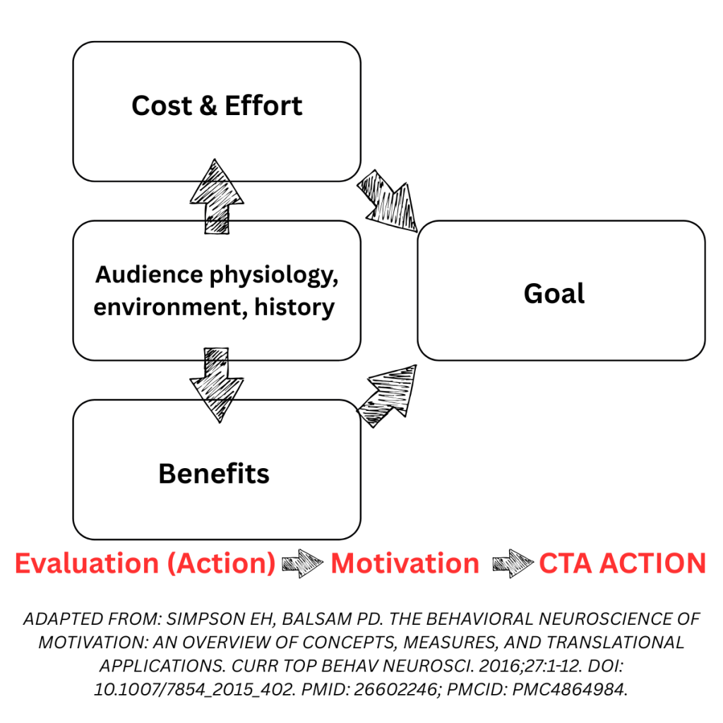
However, your ideal call-to-action may differ depending on your audience and funnel.
Developing a Clickable CTA
Your article’s structure can dictate CTA placement. The most common CTAs you might find are:
- List CTAs: Place a CTA after every list item. For example, if you are invoicing software reviewing competitors, include a link after each item that compares your product with the competitors.
- Embedded sandbox: Bring back interactive examples and test boxes or practicals. This demands immediate engagement and can prompt them to continue with a trial or demo.
- Also read sections: Call out related articles or resources through the piece.
- Simplified bottom CTAs: Keep a single CTA across all pages at the bottom. Usually as a button and unique call out design. This makes it easy to illustrate the “big ask” for each touchpoint.
- Reconsider your gated touch points: It’s not that gated content doesn’t work well. In fact, Kommunicate found that by removing the email field for a free trial, signups increased by 25.53%. To get someone to jump onboard, you need something truly spectacular or interactive. Hyper-individualized guides that provide in-depth insights and practical frameworks are one example. Quizzes that provide some useful result—such as a style quiz or competency evaluation or risk tolerance calculator can help your ideal client take link actions to actions.
However, statistics show a different side of this story. While these CTAs forms are helpful, developing a clickable call-to-action hinges on implementation. There are two key trends in particular:
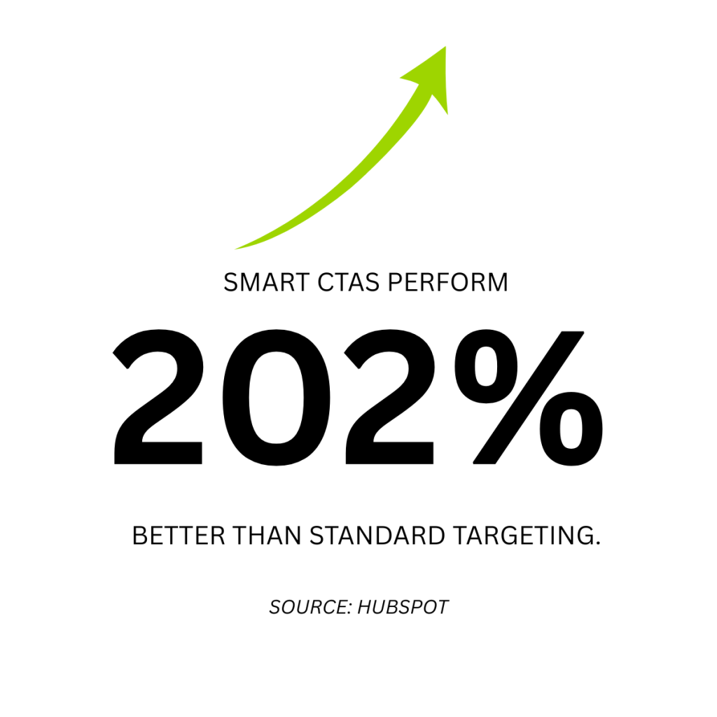
- Personalization matters: Smart CTAs perform 202% better than standard targeting. Finding ways to personalize each material for a specific audience can increase relevancy and trust, maintaining momentum to click your CTA.
- Placement is critical. Don’t be afraid to place your CTA at the bottom — one report found it increased conversions by 304%. Another study on email capture forms found considerable variation between different CTA placements, with generic end-of-post CTAs having a 1.5% conversion rate compared to a 9% rate for conversion boxes. Placement can also be seen as visibility. Placing it above the fold requires less effort and action, which might mute its effect. But strategic placements in other areas in the middle and at the end of the piece can boost your CTA’s effectiveness.
You’ll Never Know Until You Try and Test
Your call-to-action shoulder never be an afterthought. However, even “doing everything right” can still lead to lukewarm results. A/B testing is the next step to fine-tuning and optimizing your CTA. When combined with other evaluation tools like heatmaps and screen recorders, you can determine how effective your piece is in sustaining momentum, triggering motivation, and inciting action.